Expanding the bookmarking capabilities of Medium
As someone who uses Medium regularly to read and write stories, this was a personal project to explore ways to help improve the experience users have organizing the content they come across on the platform.
TIMELINE
5 days
TEAM
Sole product designer
TYPE
Personal project
RESPONSIBILITIES
User Research, UI design, Prototyping, User Testing
🚀 View the final prototype
Overview
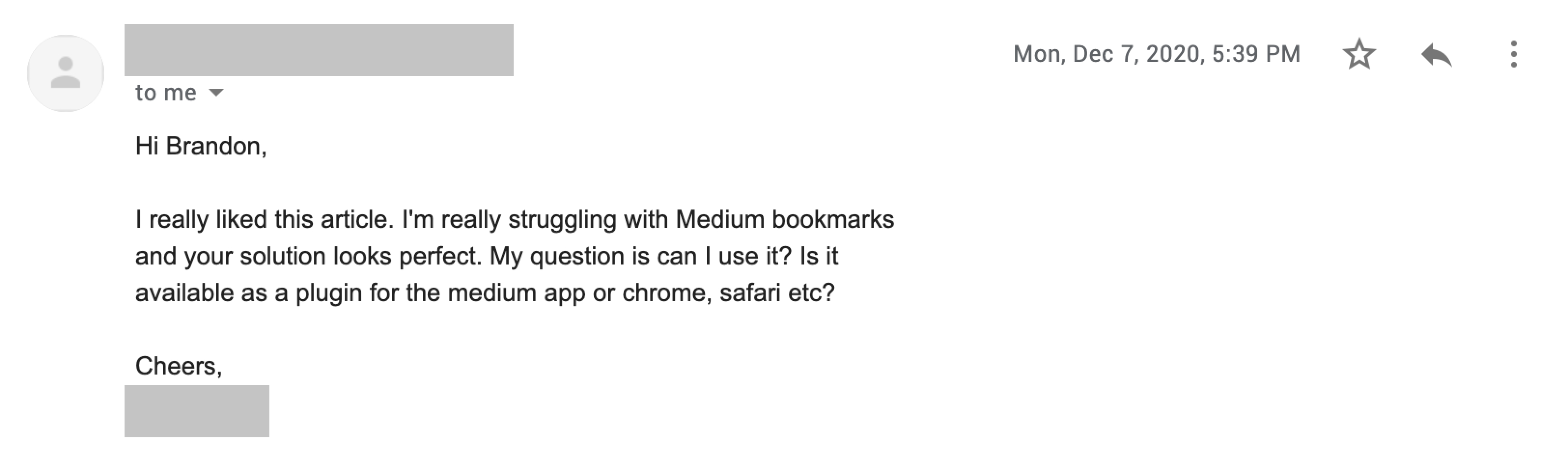
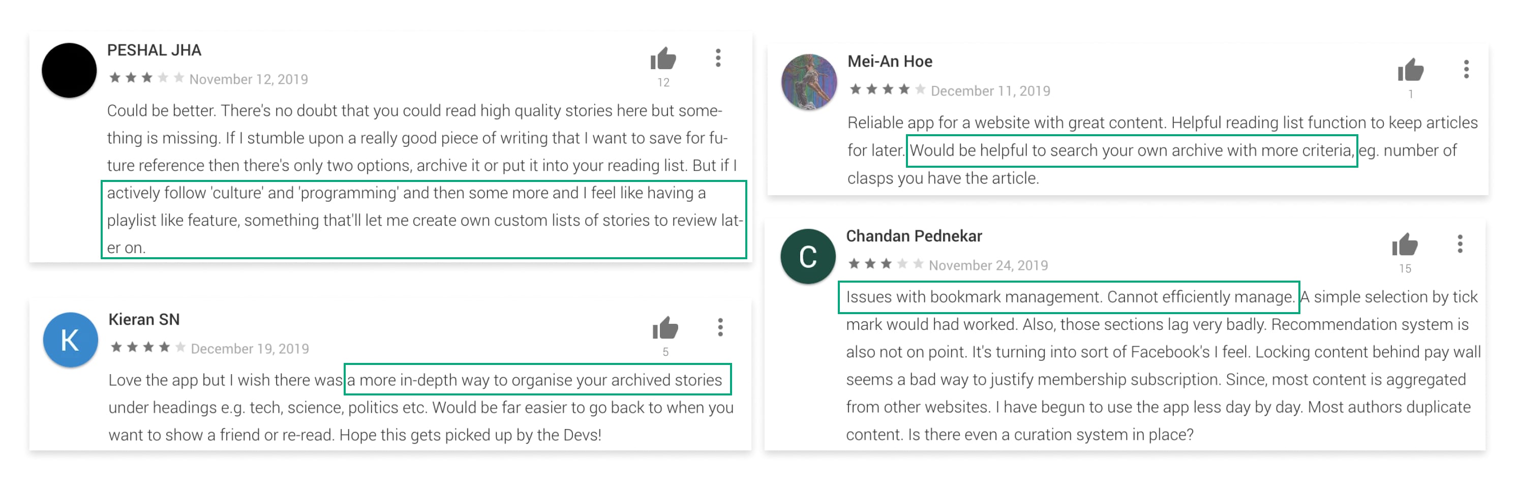
Bookmarking articles isn't efficient for future reference
When I started my journey into design, a lot, if not all of my design knowledge was informed through Medium articles. But as my library of articles started to grow, I was finding it more and more difficult to manage and sort all those articles.
Current Experience
Bookmarking an article is fairly straightforward - a user can click on the bookmark icon on the article and the icon will change states to show that the article has been saved.
The bookmarked articles will then be saved in the "Bookmarks" list where it is sorted by recency - and recency only. Users are not able to organize articles based on certain characteristics (e.g. topic, author, etc.) - making it difficult to efficiently sort through.
Problem Validation
Discovering the need for organizing bookmarked articles
To scope the problem beyond my own experiences, I went through reviews of Medium on the Google Play Store (I'm an Android user), online review sites and asked friends about their experiences with Medium's bookmarking feature.
Success
Measuring list creation
Despite being a personal project, I would want to measure usage of this feature to ensure organization of bookmarked articles is needed. The KPIs would be centred around how many of bookmarks are being grouped together.
Considerations
Medium is already well-designed
Medium is already a well-designed product that was just missing that little extra something, so before I started exploring ideas, there were a few considerations I needed to think about in order to create an effective yet practical solution.
- How would this solution integrate with Medium's current flow? Does it change current functions of bookmarking or add onto it?
- What would the experience look like if the user did not want to use your solution?
- What are the social sharing aspects of the solution?
Competitive Analysis
Understanding how other platforms organize content
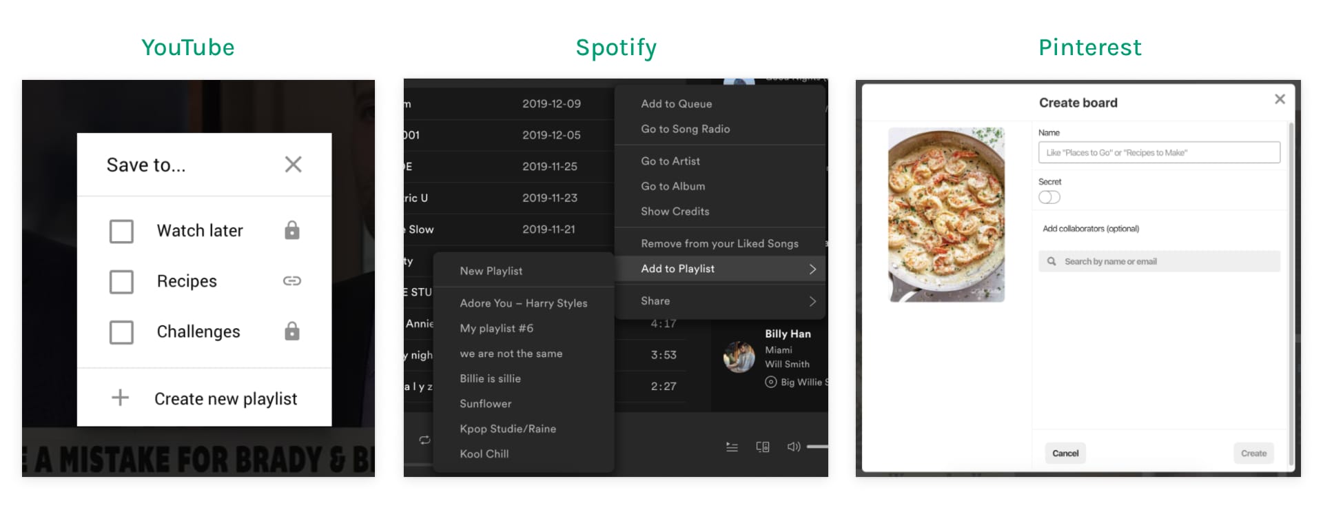
I wanted to get some inspiration on how other platforms allow their users to organize saved content. So I looked at a few popular platforms that use different types of content such as YouTube (videos), Spotify (audio) and Pinterest (photos).
Takeaways
- Users are allowed to create lists for different types of content.
- Pinterest includes a preview and Spotify highlights the song row to highlight what the user is saving.
- Pinterest and YouTube both use modals to save content while Spotify uses a popover menu.
Explorations
Understanding Medium's design system
My first step was to ensure that the redesign could be as realistic and familiar as possible so I chose to work within the constraints of Medium's existing UI by redesigning the web application in Figma.
Exploration 1: Modal screen with Article Preview
The first exploration was to use a modal screen that displays a preview of the article. This provides a lot of context for which article is being added to a list but the use of a modal is big making it very disruptive for a small action.
- ✅ Allows user to preview article being saved
- ✅ Easy to understand which list the article is being added to
- ❌ Medium uses modal screens for conversions (inconsistent use)
- ❌ Repetitive to show article content when on article page
Exploration 2: Smaller modal with no article preview
The second exploration looks to reduce the size of the modal by getting rid of the article preview. This option reduces the important of bookmarking, however, the modal makes bookmarking the primary action when browsing should be.
- ✅ Prioritizes bookmarking as primary action
- ✅ Clear indication of the article being added to lists
- ❌ Word buttons are used for big actions like following publications
- ❌ Modals are disruptive and break the flow of browsing
Exploration 3: Popover screen with checkboxes
The last and final exploration didn't disrupt the flow of browsing and puts bookmarking as a secondary action. The use of a popover screen is consistent with the use for selection different options.
- ✅ Popovers are consistent with small actions (e.g. menu bar)
- ✅ Doesn’t disrupt the flow when scrolling
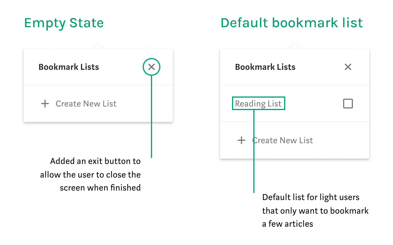
- 🚧 Confusing on how to close the screen once finished
- ❌ Checkboxes aren’t used in Medium’s UI
Key Insight
Through my user tests, I discovered users felt popover screens disrupted their flow the least, and promotes a quick action to save and continue. Medium rarely uses modal screens and when they do, it's used to convert people into users or users into paid members.
Refinements
Efficiency for both casual and power users
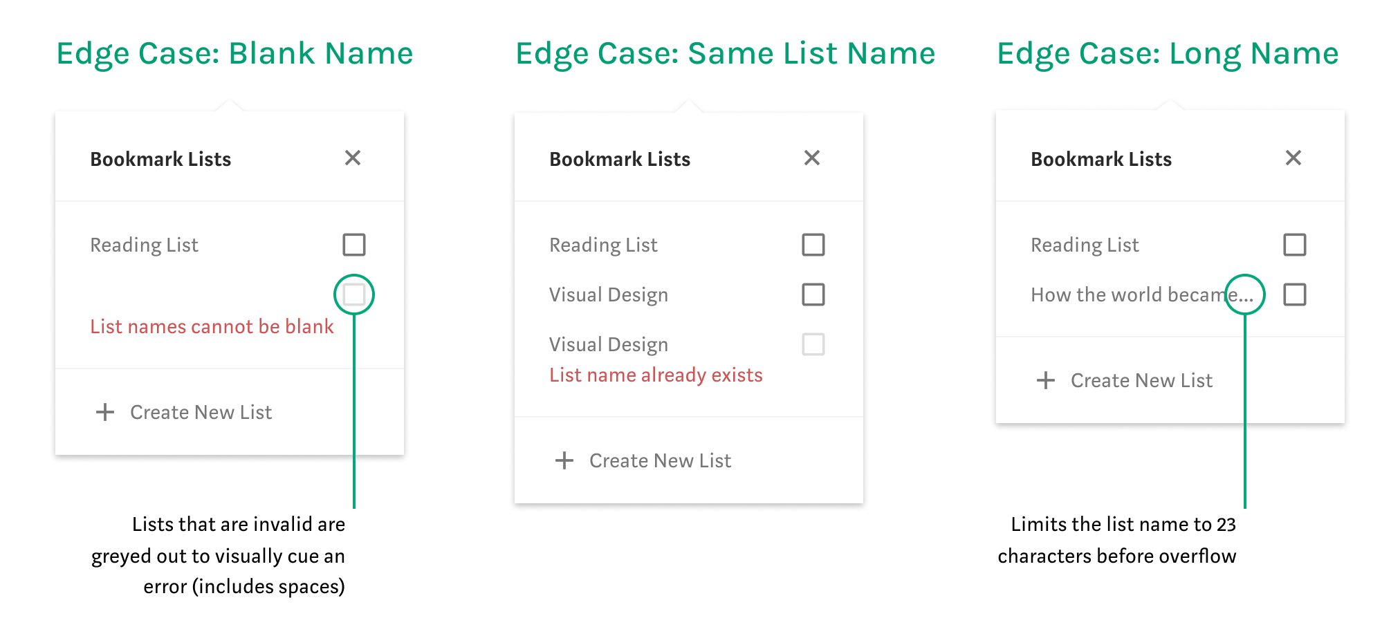
The results from the user tests gave me validation to move forward with popover screens for my final designs and to explore the different states (e.g. empty and error).
Final Designs
Designing within user expectations
The final designs comes in two components: the current bookmark interaction and the bookmarks page. Unfortunately, I wasn't able to user test the working prototypes but these were the final designs I decided to move forward with because it was consistent with Medium's current interface and it required the least amount of actions to complete the task.
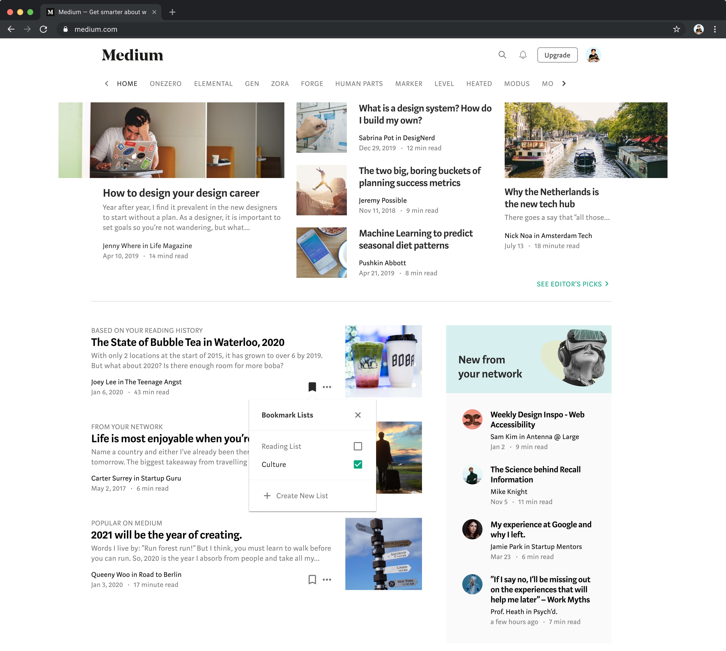
Part 1: Bookmark Interaction
There needed to be visual feedback to let the user know the action was successful. This is where I believed the use of Medium's accent green colour of a checked checkbox provided an indication of completion as it is consistent with other Medium actions (e.g. a user successfully followed a publication or author).
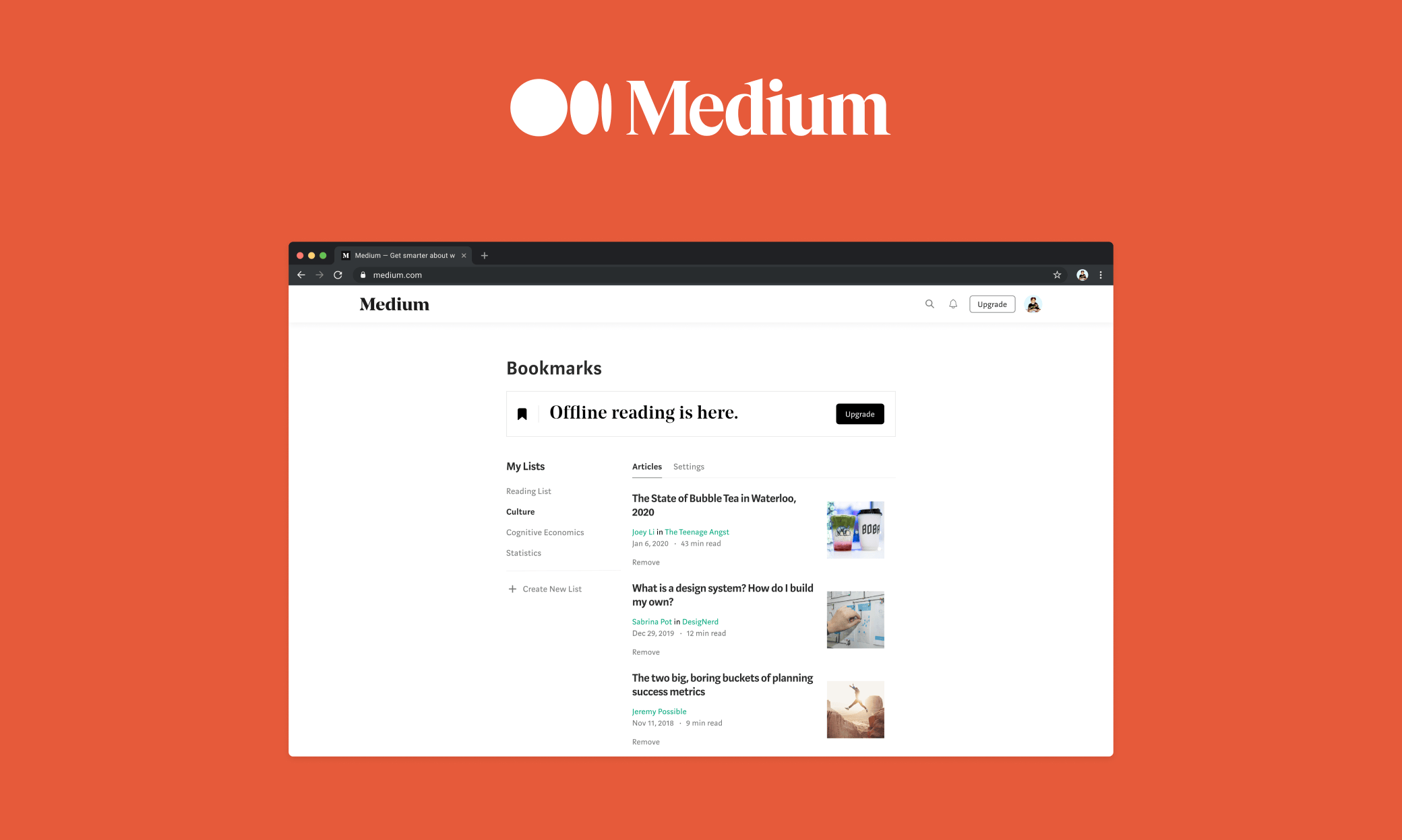
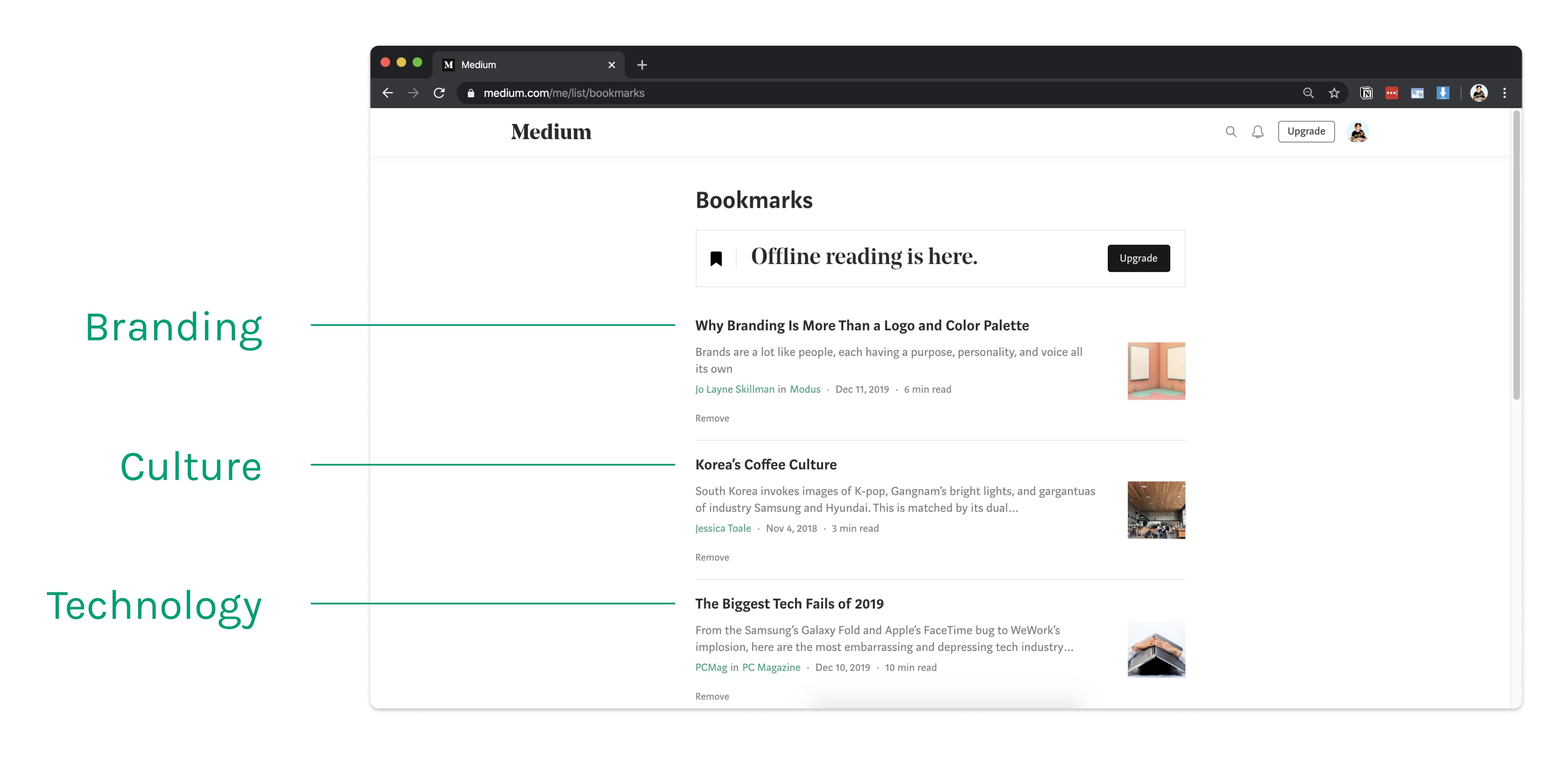
Part 2: Redesigned Bookmark's Page
The bookmark's page is where all of the articles are saved and the redesign of the page took inspiration from the Settings page on Medium—using a two-column layout.
- The first column, My Lists, would be used to navigate between the different lists that the user creates.
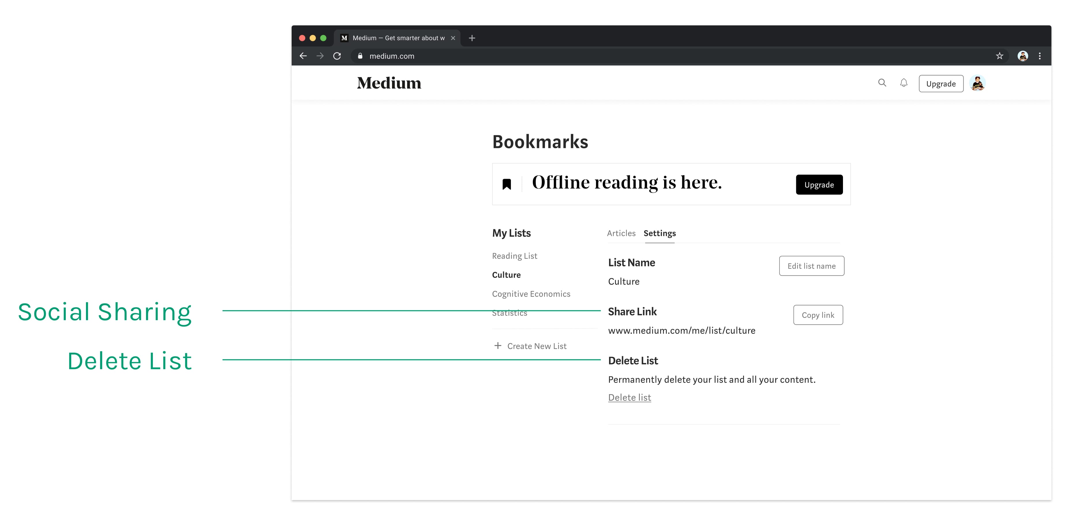
- The second column would be used to navigate between the articles stored within each list and the list settings.
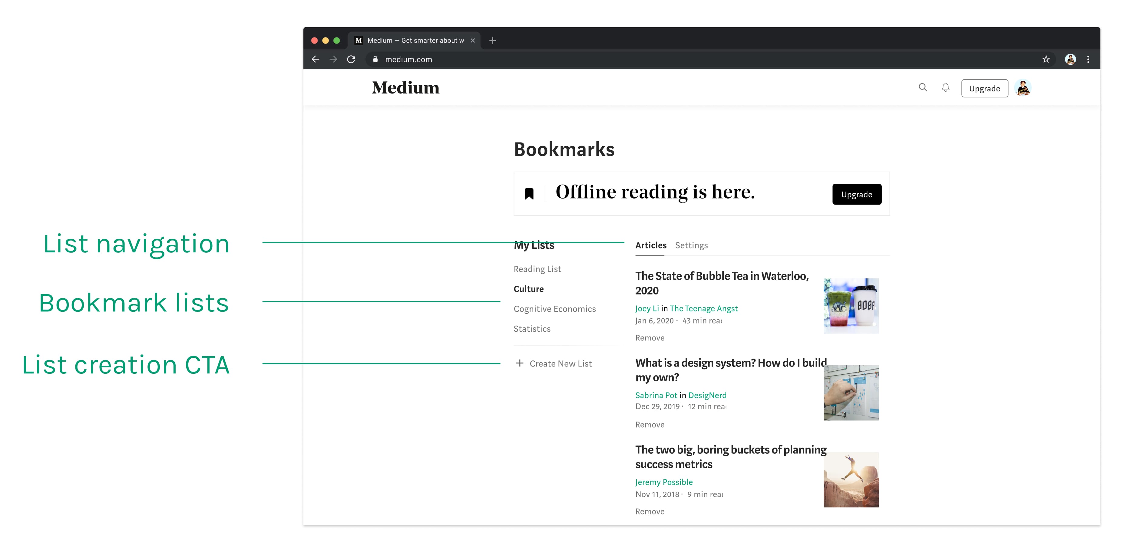
The Settings tab allows users to change the name of the list, delete the list or create a shareable link for other users to view. A shareable link is important to help bring potential users onto the platform and make it easy for existing users to interact with each other.
Reflection
Making more time for user testing
The final designs comes in two components: the current bookmark interaction and the bookmarks page. Unfortunately, I wasn't able to user test the working prototypes but these were the final designs I decided to move forward with because it was consistent with Medium's current interface and it required the least amount of actions to complete the task.
One thing I wanted to validate was the UI of the bookmarks page. Considering Medium doesn't have a page with two columns with respective navigation bars, it would have been helpful to gain perspectives on that design implementation.
- Make the designs responsive for mobile and tablet, and integrate into mobile app.
- Integrating the bookmark lists with the user's profile page.
- Explore search and sort capabilities within the bookmarks page.